

Wolters Kluwer design material calls this surface the Libra Add-in. These docs call it the embedded widget, because in the Libra codebase “add-in” means the Word and Outlook add-ins — a separate surface whose conversations are kept in their own list. Same widget, less ambiguity.
The container is yours
Libra.attach(elementOrId) positions the widget over an element you supply. The SDK’s wrapper is position: fixed and mirrors that element’s bounding box every animation frame, so:
- The widget never participates in your layout. It cannot push, shrink or reflow your content by itself.
- It follows the element through scrolling, split-pane drags, CSS transitions and layout shifts automatically.
- Whether opening the panel shrinks your content is entirely your choice — reserve the space (a flex column, a grid track) and your content shrinks; overlay the panel and it doesn’t.
examples/cdn-host, examples/vite-host) reserve space with a flex column. The README’s quickstart example floats a fixed panel in the corner instead. Both are valid.
Width
The SDK has no width option. It renders at whatever width your container has, and it draws no resize handle — if users can resize the panel, that is your control, and your product decides whether to offer it.
Reference points from the SDK itself: the two host examples set a
380px minimum on their panel, the README quickstart uses 400px, and the hosted playground runs at a 360px floor.
Wolters Kluwer design guidance (from the SDK v2 product deck, not enforced by the SDK) recommends a 480px default width for the panel. Treat it as a design default to start from, not a technical constraint — nothing in the SDK reads, validates or depends on it.
Keep the attach target mounted
The element you pass toattach() must stay in the DOM while the widget is visible. If a re-render removes it, the SDK detaches itself, logs a warning, and the widget disappears:
Libra.attach(newTarget) to bring it back. This is the most common failure mode in React and Svelte hosts that conditionally render the panel container:
mountTarget once at init() and never move it: an iframe reparented in the DOM is reloaded by the browser, which destroys the chat session. See Embedding for the stacking-context rules.
Who draws the header
There are two bars, and they are independent.1
The SDK headbar — optional, opt-in via onClose
The Libra wordmark and a close button, and nothing else. It is rendered if and only if you pass
onClose to Libra.init(). There is no boolean setting: supplying the callback is the switch, and it is decided at init time.2
The chat navbar — always present
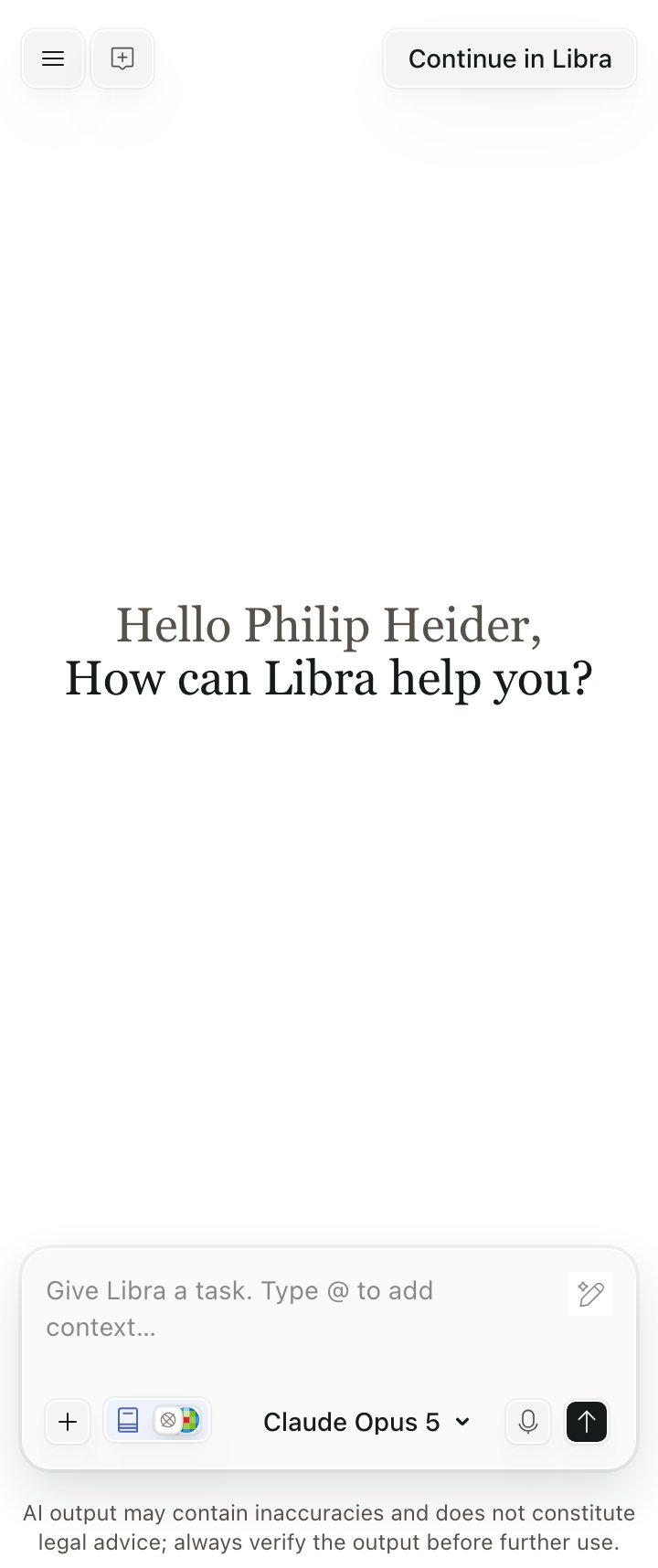
On the authenticated chat screen: a hamburger Menu (Projects, Chat History, Sign Out), New Chat, and Continue in Libra. This bar is always there, with or without the headbar.
onClose and the iframe contains no close affordance at all — the only way to dismiss the widget is your own control calling Libra.detach(). The SDK does not check that you have one, so omit onClose only when your product genuinely renders its own header or close button.
Left: with onClose, the SDK draws its headbar. Right: without it, the host owns the frame entirely.
Opening the widget
The SDK provides no entry point; you place one. Wolters Kluwer design guidance recommends a persistent, consistently positioned “Ask Libra” control — a floating button, a header item, or whatever matches your product’s layout — plus an optional promotional card introducing Libra to users who have not tried it. Both are host-side UI with clear Libra branding; neither ships with the SDK. TriggerLibra.attach() from that control’s click handler rather than on page load, so the browser treats the authentication popup as user-initiated. See Authentication.
Checklist
- The panel container is mounted for as long as the widget is visible, and hidden with CSS rather than unmounted.
-
mountTargetis set once, withisolation: isolateand notransform/filter/containon its ancestors. - The panel is at least 380–400px wide; 480px if you are following WK design guidance.
- Either
onCloseis supplied, or your product renders its own close control that callsLibra.detach(). - The entry point is a user-initiated click, not an automatic open.