> ## Documentation Index
> Fetch the complete documentation index at: https://sdk.libratech.ai/llms.txt
> Use this file to discover all available pages before exploring further.
# Panel and placement
> Where the widget lives on your page, how wide it should be, and who owns the frame around it
The SDK renders a chat panel; **your product owns the frame around it**. This page covers the host-side decisions: the container, its width, the entry point that opens it, and which header the user sees.
Wolters Kluwer design material calls this surface the **Libra Add-in**. These docs call it the *embedded widget*, because in the Libra codebase "add-in" means the Word and Outlook add-ins — a separate surface whose conversations are kept in their own list. Same widget, less ambiguity.
## The container is yours
`Libra.attach(elementOrId)` positions the widget over an element you supply. The SDK's wrapper is `position: fixed` and mirrors that element's bounding box every animation frame, so:
* The widget **never participates in your layout.** It cannot push, shrink or reflow your content by itself.
* It **follows the element** through scrolling, split-pane drags, CSS transitions and layout shifts automatically.
* Whether opening the panel shrinks your content is **entirely your choice** — reserve the space (a flex column, a grid track) and your content shrinks; overlay the panel and it doesn't.
The reference integrations in the SDK package (`examples/cdn-host`, `examples/vite-host`) reserve space with a flex column. The README's quickstart example floats a fixed panel in the corner instead. Both are valid.
## Width
The SDK has **no width option**. It renders at whatever width your container has, and it draws no resize handle — if users can resize the panel, that is your control, and your product decides whether to offer it.
| Width | What actually happens |
| --------------- | -------------------------------------------------------------------------------------------------------------------------- |
| Below 400px | Composer controls switch to their small variant. This is the only width threshold with a visible effect inside the widget. |
| 400px and above | No further changes. Content reflows; nothing new appears. |
Reference points from the SDK itself: the two host examples set a `380px` minimum on their panel, the README quickstart uses `400px`, and the hosted playground runs at a `360px` floor.
**Wolters Kluwer design guidance** (from the SDK v2 product deck, not enforced by the SDK) recommends a **480px default width** for the panel. Treat it as a design default to start from, not a technical constraint — nothing in the SDK reads, validates or depends on it.
**Widening the panel does not reveal more features.** Inside the SDK the composer is pinned to its compact layout at startup, so the Tools and Research buttons stay icon-only at *every* width — a wider panel cannot bring their text labels back. Users who need Review, Discovery or Playbooks go to the Libra Workspace, not to a bigger panel.
## Keep the attach target mounted
The element you pass to `attach()` must stay in the DOM while the widget is visible. If a re-render removes it, the SDK detaches itself, logs a warning, and the widget disappears:
```
[@libra/sdk] Target element was removed from the DOM — widget detached.
Call Libra.attach(newTarget) to re-attach (session is preserved).
```
The chat session survives — call `Libra.attach(newTarget)` to bring it back. This is the most common failure mode in React and Svelte hosts that conditionally render the panel container:
```jsx theme={null}
// Conditional rendering unmounts the target and silently detaches the widget.
{isOpen && }
// Keep it mounted and hide it instead.
```
Set `mountTarget` once at `init()` and never move it: an iframe reparented in the DOM is reloaded by the browser, which destroys the chat session. See [Embedding](/guides/embedding#stacking-context) for the stacking-context rules.
## Who draws the header
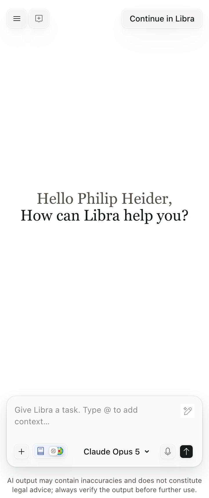
There are **two** bars, and they are independent.
The Libra wordmark and a close button, and nothing else. It is rendered **if and only if** you pass `onClose` to `Libra.init()`. There is no boolean setting: supplying the callback is the switch, and it is decided at init time.
On the authenticated chat screen: a hamburger **Menu** (Projects, Chat History, Sign Out), **New Chat**, and **Continue in Libra**. This bar is always there, with or without the headbar.
Omit `onClose` and the iframe contains **no close affordance at all** — the only way to dismiss the widget is your own control calling `Libra.detach()`. The SDK does not check that you have one, so omit `onClose` only when your product genuinely renders its own header or close button.
 If you render your own header, Wolters Kluwer design material asks that it simply read **"Libra"**. Nothing in the SDK enforces this — confirm the current wording with the Libra design team before shipping.
## Opening the widget
The SDK provides no entry point; you place one. Wolters Kluwer design guidance recommends a **persistent, consistently positioned "Ask Libra" control** — a floating button, a header item, or whatever matches your product's layout — plus an optional promotional card introducing Libra to users who have not tried it. Both are host-side UI with clear Libra branding; neither ships with the SDK.
Trigger `Libra.attach()` from that control's click handler rather than on page load, so the browser treats the authentication popup as user-initiated. See [Authentication](/guides/authentication).
## Checklist
* [ ] The panel container is mounted for as long as the widget is visible, and hidden with CSS rather than unmounted.
* [ ] `mountTarget` is set once, with `isolation: isolate` and no `transform` / `filter` / `contain` on its ancestors.
* [ ] The panel is at least 380–400px wide; 480px if you are following WK design guidance.
* [ ] Either `onClose` is supplied, or your product renders its own close control that calls `Libra.detach()`.
* [ ] The entry point is a user-initiated click, not an automatic open.
If you render your own header, Wolters Kluwer design material asks that it simply read **"Libra"**. Nothing in the SDK enforces this — confirm the current wording with the Libra design team before shipping.
## Opening the widget
The SDK provides no entry point; you place one. Wolters Kluwer design guidance recommends a **persistent, consistently positioned "Ask Libra" control** — a floating button, a header item, or whatever matches your product's layout — plus an optional promotional card introducing Libra to users who have not tried it. Both are host-side UI with clear Libra branding; neither ships with the SDK.
Trigger `Libra.attach()` from that control's click handler rather than on page load, so the browser treats the authentication popup as user-initiated. See [Authentication](/guides/authentication).
## Checklist
* [ ] The panel container is mounted for as long as the widget is visible, and hidden with CSS rather than unmounted.
* [ ] `mountTarget` is set once, with `isolation: isolate` and no `transform` / `filter` / `contain` on its ancestors.
* [ ] The panel is at least 380–400px wide; 480px if you are following WK design guidance.
* [ ] Either `onClose` is supplied, or your product renders its own close control that calls `Libra.detach()`.
* [ ] The entry point is a user-initiated click, not an automatic open.